Colour of the month: Violet
11/23/2023 |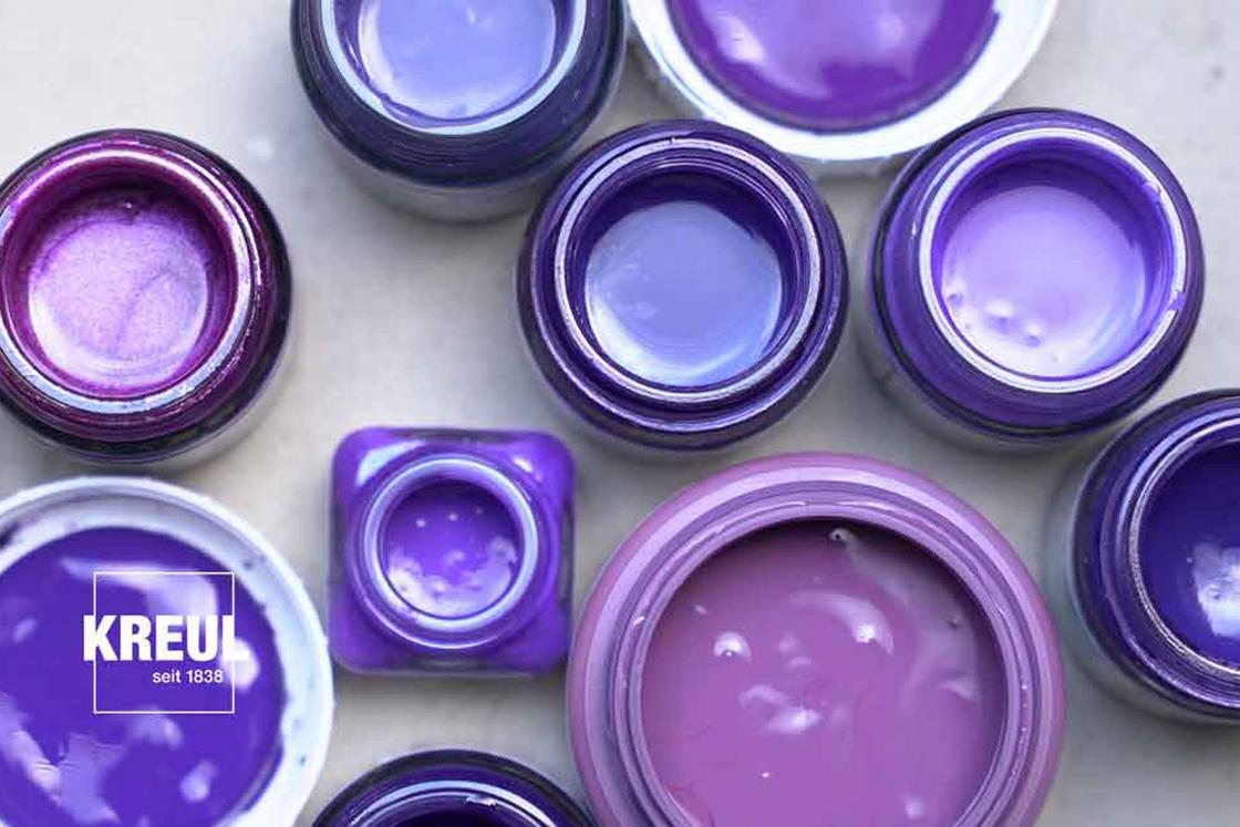
A colour of power and exclusivity
For a long time, violet was not accessible for commoners, in fact it was forbidden. The colour purple was the reserve of king and queens. Violet was exclusive, very expensive, and it was very complicated to produce. Thousands of sea snails were needed to extract just a few grams of dye. A foul-smelling process, which is fortunately a thing of the past.
Then, in the 19th century, the British chemist William Perkin discovered a violet dye that could be easily produced. The once exclusive and regal colour could finally be made accessible to a mass market. Violet soon enjoyed huge popularity. Violet-coloured fabrics were regarded as particularly chic. And that is why other possibilities were soon explored to dye violet, e.g. with poisonous metal cobalt salts. Nowadays, violet pigments are produced synthetically, e.g. cobalt violet, manganese violet or dioxazine violet.
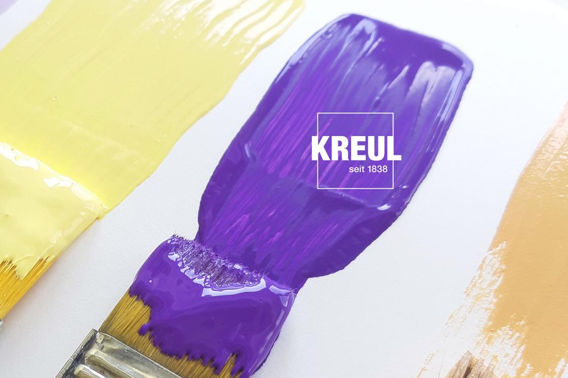
At KREUL, we use only pigments of synthetic origin for violet. They have the advantage that they are light-fast and the colours they produce are always the same. Sometimes we use the synthetic pigments dioxazine violet and chinacridon violet to get violet. Very often we mix our own violet by combining red and blue pigments. This means we can offer lots of violet shades.
Violet in painting: a popular constrast colour
Violet was not only popular in fashion or as a symbolic colour for budding feminism. Artists were also enamoured by this colour. So violet is frequently found in impressionistic masterpieces. Especially in combination with yellow and as a colour for shadows.
The impressionists painted outdoors and wanted to express the play of light between the different colour hues on canvas. They did this with a particular short brushstrokes technique, but also with the application of complementary colours. The complementary colour for warm sunny yellow is cool violet – they had found the perfect colour for shadows as it was much more animated and vibrant than black. But violet was soon not only a colour for shadows. “I have finally discovered the true colour of the atmosphere. It is violet. Fresh air is violet,” proclaimed the artist Claude Monet.
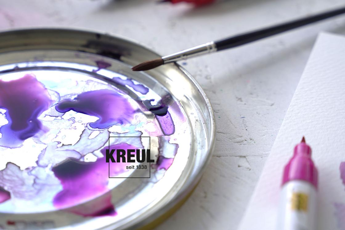
Violet: mix of red and blue
Violet is one of the colours of the rainbow. It appears as a result of the refraction of white light. However, here we cannot always differentiate exactly between very dark blue and violet. In the colour wheel, the colours lie next to each other. So if you use blue and violet hues in an artwork, you always get a harmonious overall impression.
Violet can be easily mixed from the primary colours of red and blue. Lots of blue makes the colour darker, more red gives a bordeaux shade. A very red violet is obtained if you mix magenta and cyan, e.g. with the SOLO GOYA Aqua Paint Marker. Try it out for yourself!
