Colour of the month: Dark Blue
10/18/2023 |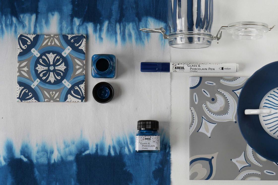
Dark in many blue variations
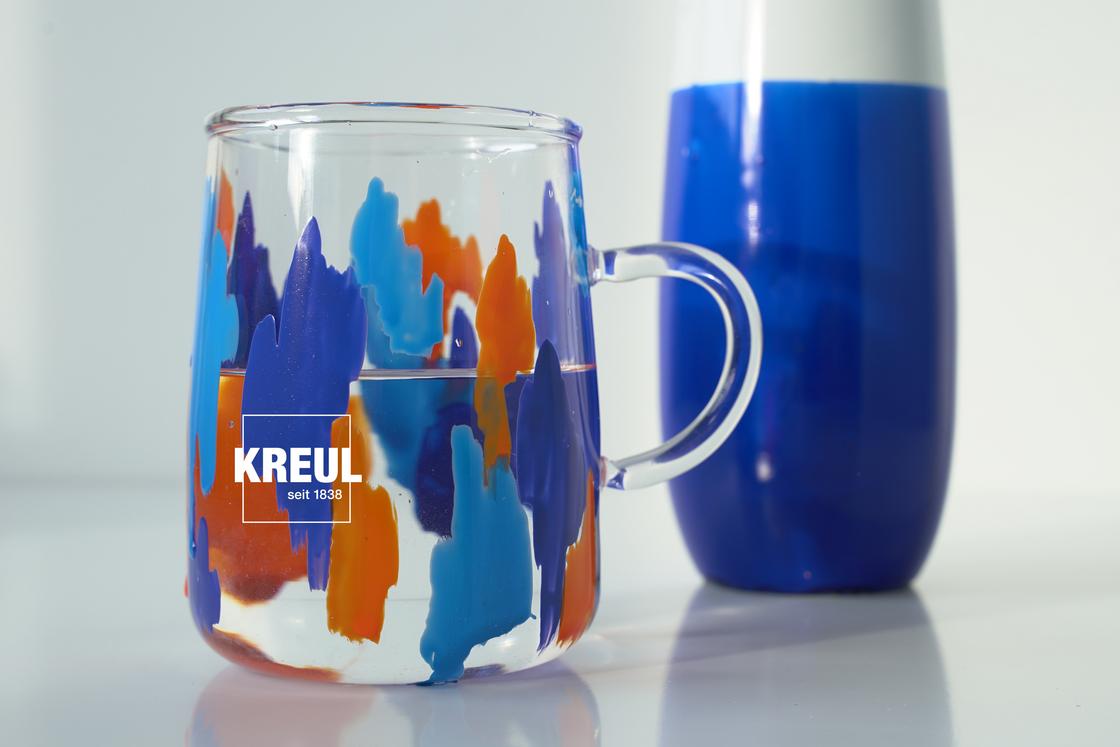
Dark blue is a simplified term for a blue shade in the dark colour range. For some products like SOLO GOYA Triton Acrylic or KREUL Acrylic Matt Paint, we supply Dark Blue as a colour in itself. But usually what is widely described as dark blue can be subdivided into colour names such as ultramarine blue, cobalt blue, indigo, Prussian blue and many more. Each of these variants has different characteristics and is used accordingly. SOLO GOYA Acrylic Ultramarine Blue, for instance, is warm colour, while KREUL el Greco Acrylic Cobalt Blue is a cooler shade. KREUL Glass & Porcelain Classic Royal Blue makes you think of royal blue ink, while KREUL Glass & Porcelain Chalky Navy Blue recalls maritime memories.
In company logos, as paint for cars, in fashion or design – you'll find dark blue everywhere today. The popular colour radiates calmness, freshness, class and trust. As a primary colour, blue is a must-have on an artist’s basic palette. But for a long time, blue wasn’t part of the life of ordinary people. In nature, you will often find blue in plants, but it was a very laborious and costly process to extract blue pigments.
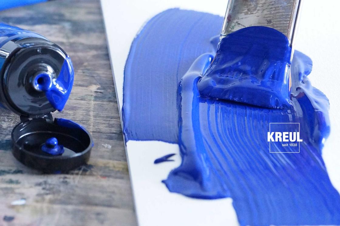
A colour that was once the reserve of the well-to-do
Ultramarine used to get its colour from the semi-precious stone lapis lazuli, with the best-quality stones coming from northern Afghanistan. They were difficult to get and the production method to obtain the ground pigment required many work steps. Blue used to be a status symbol. Cleopatra used ground lapis lazuli as mascara, and in the days of Albrecht Dürer, ultramarine was weighed against gold. So blue was used only rarely, very sparingly and mainly for lucrative pieces of art. Mostly only in depictions of Jesus Christ or the Virgin Mary.
Another dark blue dye was extracted for thousands of years in Asia: indigo, a bright inky blue. It comes from the seeds of the indigo plant and was used primarily in India and Japan for dyeing cloth. The demand for indigo was one of the reasons for the first trade routes from Europe to Asia.
German indigo or Erfurt blue is the name given to deep blue woad. It comes from the leaves of the dyer’s woad plant. But extracting the dye was a laborious, dirty and foul-smelling job. In Europe, woad was an alternative to indigo from Asia, but the huge effort involved and the large quantities that were needed for its production made woad expensive. This blue colour was also only the reserve of the upper echelons of society.
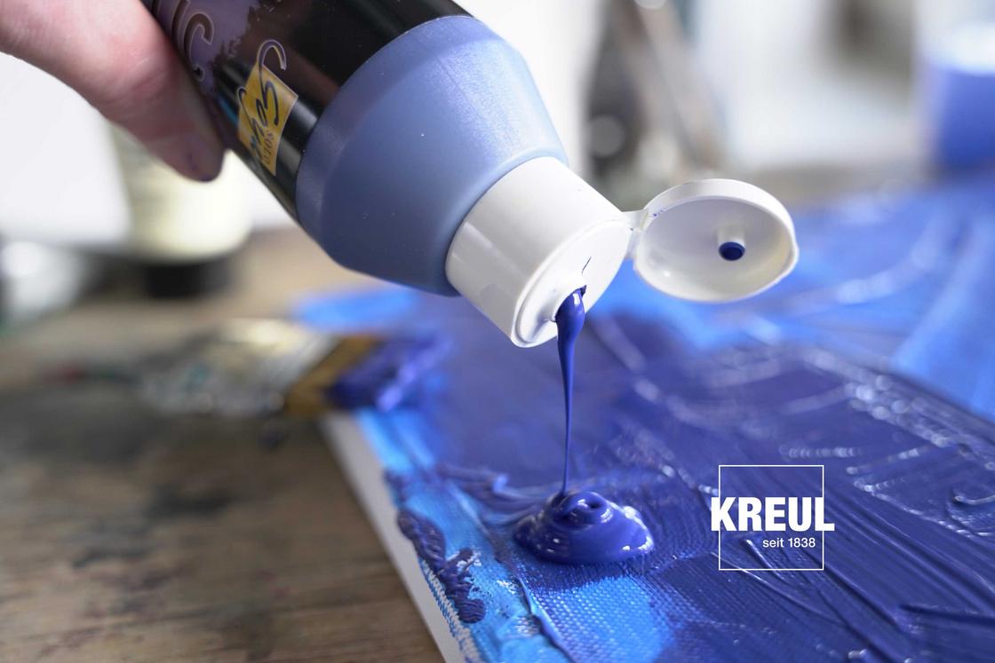
Blue's now everywhere thanks to synthetic pigments
But from the 18th century, blue was no longer a colour reserved for the "blue-blooded". Two chemists developed a chemical, dark blue pigment. In 1782, the German-Swedish chemist Carl Wilhelm Scheele made Prussian blue. This was used to dye the uniforms of the Prussian infantry regiments. In 1826, the French chemist Jean-Baptiste Guimet invented French ultramarine. Blue was now more affordable and there was no stopping its rise in popularity. In the 20th century, works by Wassily Kandinsky lived from vibrant dark blues, while, during his blue period, Pablo Picasso painted passionately and exclusively with this dark and vivid shade of colour.
As a manufacturer, we are happy that we can use different synthetic blue pigments. With these, we create blue hues that meet the needs of artists, creatives and even children. And of course the blue colours made by KREUL can be mixed to make other colours. For example, you can make dark blue even darker. How? Just add Burnt Umbra to Ultramarine Blue and love the almost black shade of blue.
