
Three facts about dark blue that can influence your painting
12/18/2024 |
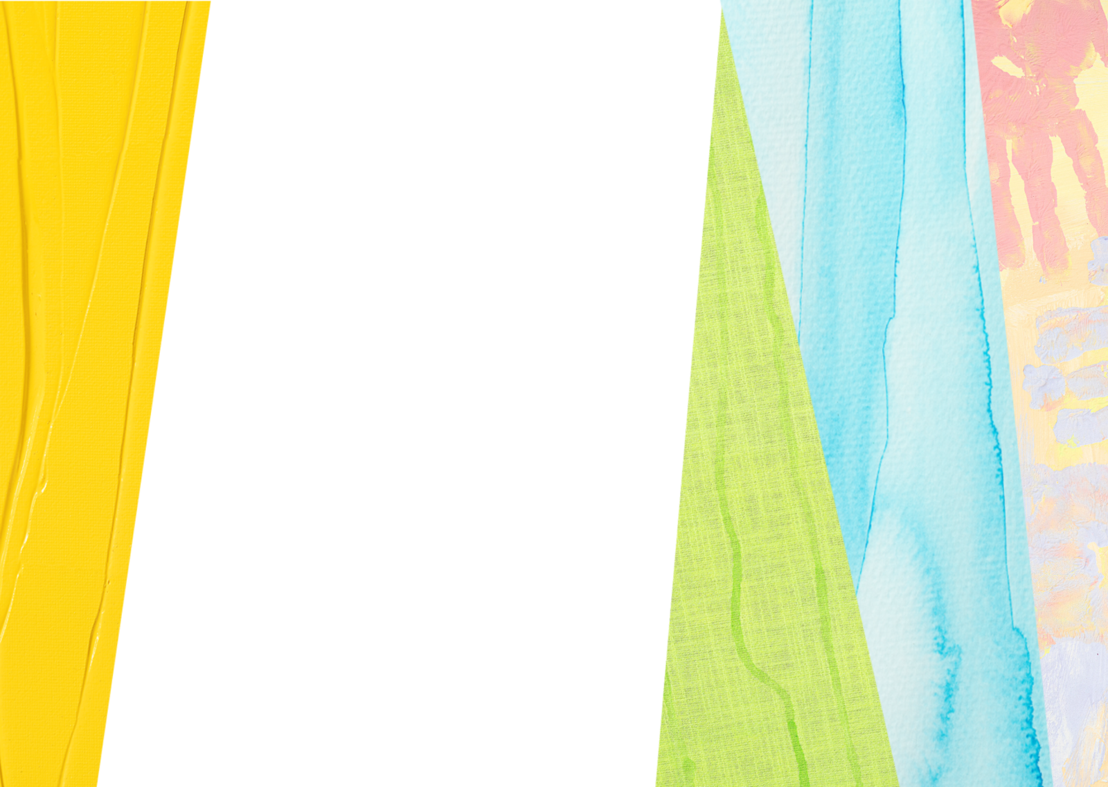
Simultaneous contrast: next to blue, colours look more orangish
Colours influence each other in their colour impact. So a warm light brown can look almost orange when next to blue. Red looks warmer next to cool blue than next to neutral grey. Why is that the case? Behind this is the phenomenon of "simultaneous contrast". This says that in the environment of certain colour you also perceive the complementary colour at the same time although it is not actually there. The complementary colour of blue is orange. Warm light brown, which is positioned next to orange in the colour circle, is then automatically perceived as orange. The eye tries to create a natural balance. Many artists use this effect, consciously playing with it. Dark blue like, e.g. SOLO GOYA Acrylic Ultramarine Blue, makes Light Ochre look warmer and more radiant.
.

Neutralizing blue to grey
Colours have a very high degree of saturation when you use them direct from the bottle or tube. They really shine and can sometimes seem too bright. With selective mixing, you can tone down colours. You can make Ultramarine Blue greyer by mixing in Burnt Sienna Reddish. If you mix the same parts of the two colours, you even get dark anthracite grey. A good possibility to make blue less intense or to mix dark grey yourself.

Lightening dark blue: greenish tinge to pale violet
You get light blue by lightening dark blue with lots of white. But the warmth of the blue shade determines in which direction the mixed light blue tends to go. Cool blue shades like SOLO GOYA Triton Acrylic Cerulean Blue become almost like light turquoise when mixed with white. This cool light blue has a slight greenish tinge and is ideal to paint a sky on a bright summer’s day. Warm blue like SOLO GOYA Triton Acrylic Ultramarine Blue mixed with white looks almost like light violet blue. It tends slightly towards violet. It is perfect for painting delicate flowers or for a sky on a cloudy day.