Finding the right shade: this is how our blues differ
06/26/2023 |- SOLO GOYA Acrylic
- KREUL Triton Acrylic Liquid
- Ideen für Künstler
Ultramarine blue: a dark blue for warm touches
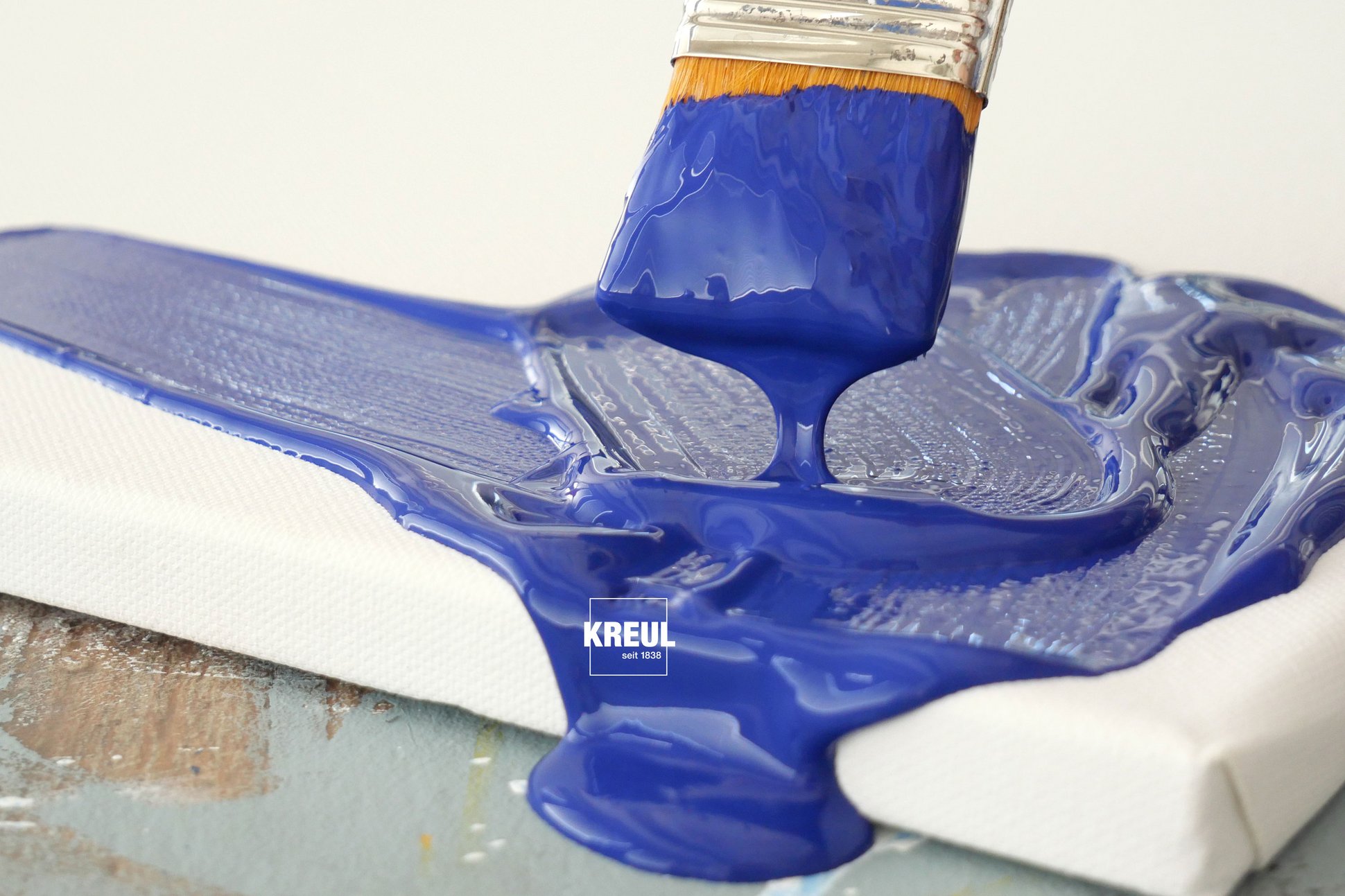
This blue used to be extracted from ground lapis lazuli and was extremely expensive. Since the development of a synthetic ultramarine pigment, this blue has been part of an artist's basic kit. And rightly so, ultramarine blue is used for striking accents, like those employed by Wassily Kandinsky.
Ultramarine blue is a dark blue shade. The SOLO GOYA Triton Acrylic ultramarine is semi-transparent while the SOLO GOYA Acrylic shade is opaque. Its coverage becomes more opaque when you add white to it. This mixed colour reveals the warm undertone of ultramarine blue. And so this mixed light blue tends toward violet. Perfect for painting delicate blooms. Less suitable for painting a blue sky. Here we recommend a mix containing a cooler blue like primary blue.
Ultramarine blue straight out of the paint bottle is as radiant as the vast ocean on a sunny day. As a mixing colour, it gives red a subtle blue cast, With yellow, it creates warm, olive green shades. You can go darker with some umbra. With more umbra and some orange, you get a mixed grey shade.
Primary blue: basic blue for radiant, cool mixes
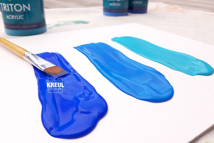
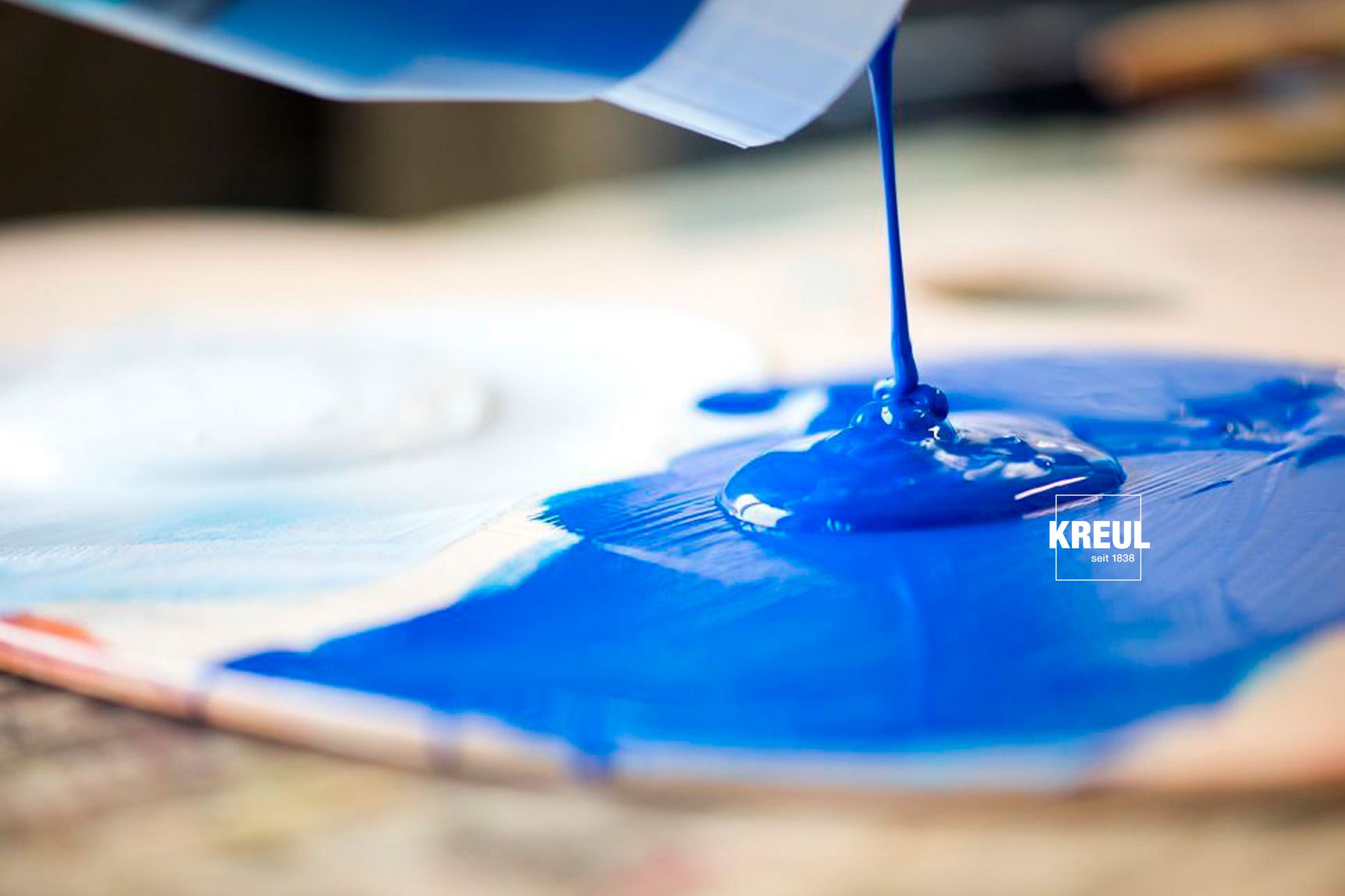
This blue is in the mid tonal range, with a cool undertone. The term "primary" indicates that this blue is one of the primary colours. And that is absolutely so, as you can mix lots of colours with primary blue.
Primary blue is a good basis for mixing fresh green shades. By mixing it with magenta, you get radiant purple shades. This blue hue is also the perfect base colour for painting a brilliant blue sky. For this, you add some primary blue to lots of white.
In the SOLO GOYA Triton Acrylic line, primary blue is semi-transparent and is good for colour washes. Layers under this tend to have a bluish tinge and become darker or cooler. The SOLO GOYA Acrylic primary blue is opaque and suitable for overpainting in blue.
Turquoise: shimmering blue with green nuances
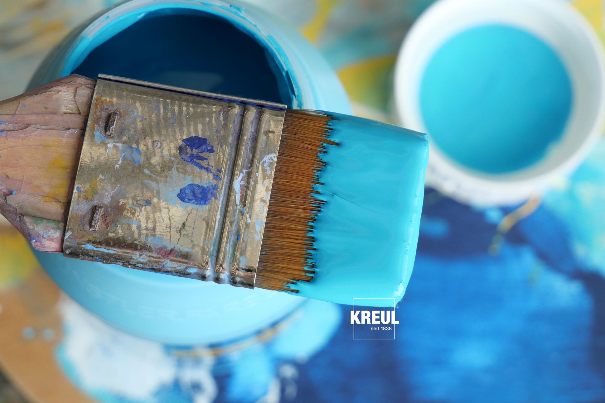
Painting vibrant underwater worlds or dreamy Caribbean beaches? That works best with turquoise. On a white background, alongside a dark contrast area, it glows with a shimmering radiance. In its pure form, that is direct out of the tube or bottle, this colour is an absolute eyecatcher in a picture. So now you only need to choose between the lighter turquoise blue from the SOLO GOYA Triton Acrylic line. Or the darker, more greenish turquoise in the SOLO GOYA Acrylic palette.
Turquoise is an ideal start-off colour to mix jazzy green shades. Just add turquoise into a cool lemon: When turquoise is lightened with white, a joyful shade emerges that is perfect for water reflections. A ready-mixed variation is SOLO GOYA Acrylic Turquoise Blue Light. If you mix this with a little Wine Red, you get a stylish mallow shade. Turquoise is not one of the primary shades on a palette, but it is an ideal colour to lift your own artistic skills to a new level. Turquoise makes summer artwork just a touch more vibrant.
