Colour of the Year: Peach
01/15/2024 |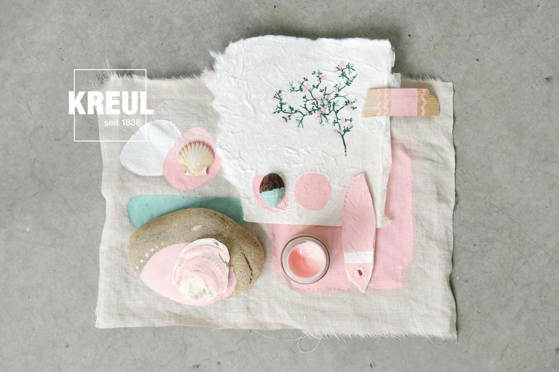
Shades of peach at KREUL
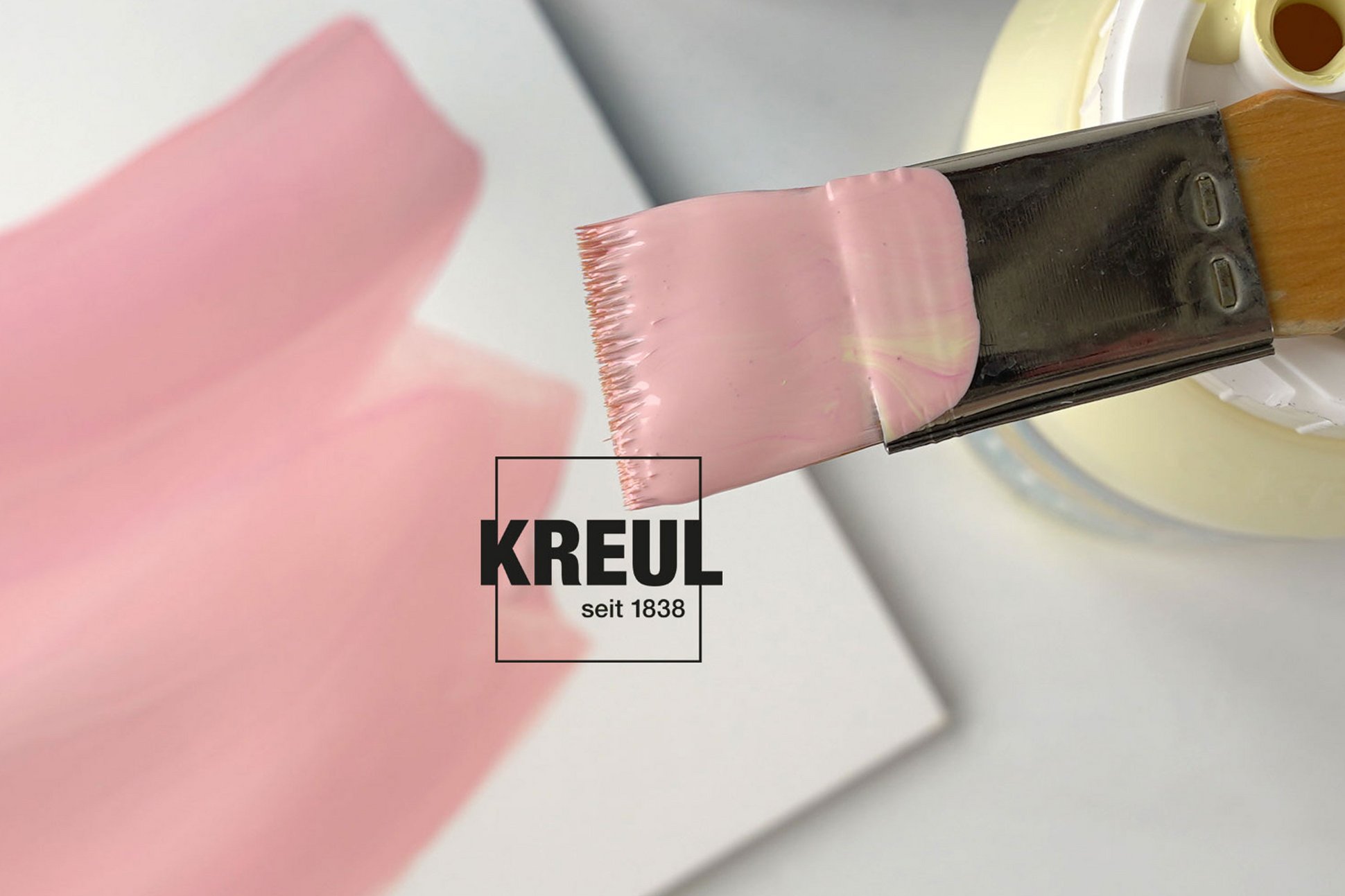
It's wonderful what mood can be expressed with this soft and gentle colour. Let’s start using it for our artwork and DIY projects straightaway. We don’t have the Pantone colour Peach Fuzz in our assortment. But we offer other nuances in the warm rose pink range that look similar to this peach shade. These KREUL variants conjure delight, freshness and lightness:
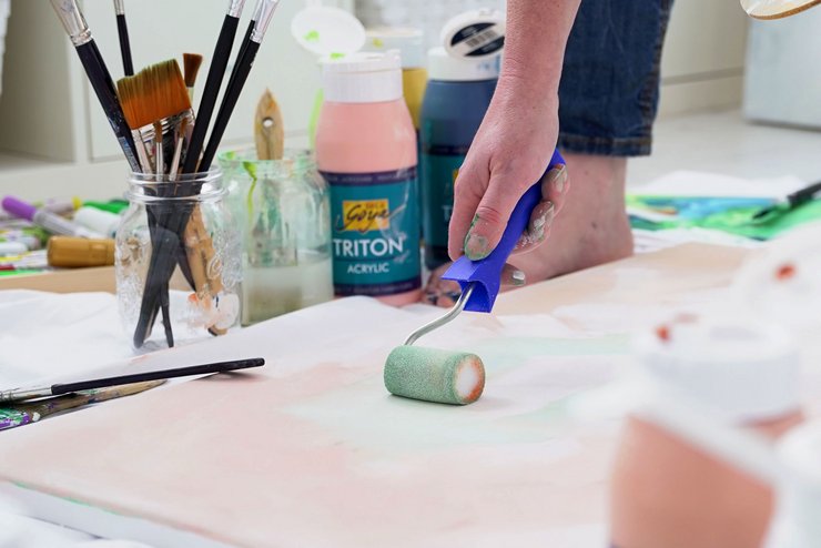
• SOLO GOYA Triton Acrylic Peach Pink
• SOLO GOYA Acrylic Pastel Rose
• KREUL el Greco Acrylic Pastel Rose
• KREUL Javana Fabric Paint for Light- and Dark-Coloured Texiles Rose
• KREUL Nature Hibiscus Flower
Sensuous colour with nostalgic charm
The colour peach takes its name from the sweet summer fruit. Although ripe peaches are redder and more intense in colour in reality than the delicate shade. Nevertheless, we associate the warmth of southern climes, friendship, affection and a hint of romance with this colour. It has a penchant for nostalgia and is used in advertising or in films as the backdrop for atmospheric moments. With a peach-coloured photo filter, photos instantly appear more wistful.
In the 1990s, peach and apricot were popular as wall colours, frequently in combination with terracotta for a cosy flair. But the popularity of the colour goes back much further. The art nouveau movement at the beginning of the 20th century already favoured peach shades. The Czech artist Alfons Mucha designed posters depicting graceful female figures. He succeeded in expressing a sensuous, romantic aura thanks to his generous use of the colour peach.
A blend of red, yellow and white
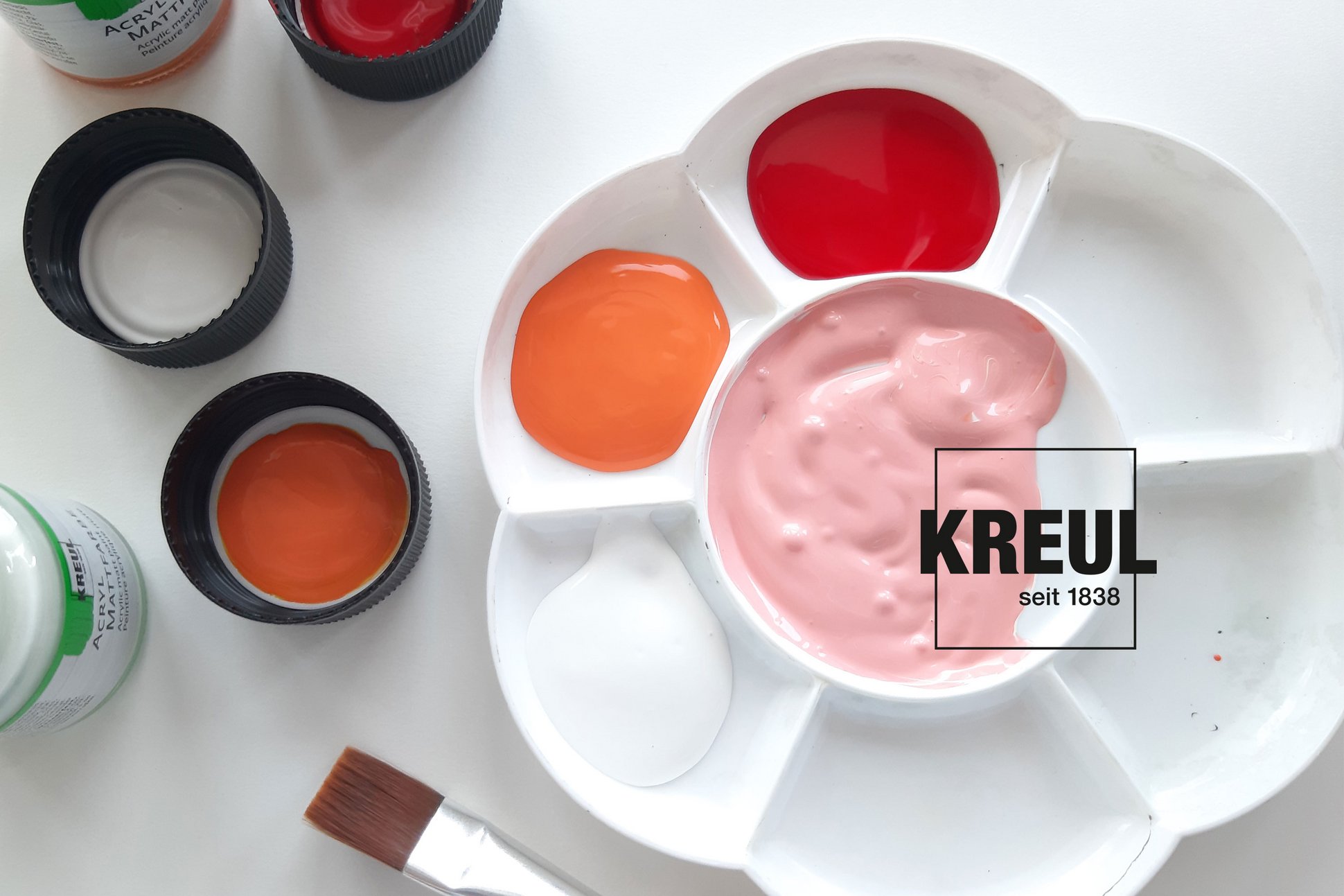
Peach lies somewhere between pink and orange. It isn't that easy to get the colour right. How can you mix the colour yourself? You can get a fast result by mixing a warm reddish orange – e.g. KREUL el Greco Acrylic Vermillion Red with lots of white. Another option is to mix SOLO GOYA Triton Acrylic Magenta with lots of Ivory. You get a stronger peach colour by mixing SOLO GOYA Acrylic Fluorescent Pink, Fluorescent Yellow and lots of white. If you prefer a toned down colour, mix SOLO GOYA Acrylic Carmine Red, Light Ochre and a large quantity of White. Have fun trying these out!
Background: Pantone Colour of the Year
For over 20 years, the Pantone Color Institute has been choosing its Pantone Colour of the Year. Many industries orient themselves to this colour. The selection process for the Pantone Colour of the Year draws on trend analyses. Colour experts are on the look-out worldwide to identify which colours are currently influencing the entertainment and film branch, art collectons and the works of new artists, fashion and design.
