Colour of the month: Mint
07/24/2023 |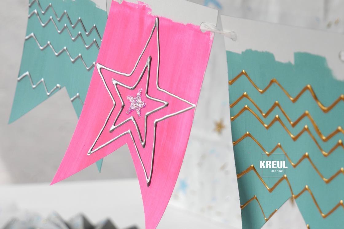
A modern take on a retro colour
Mint is a colour that was made in a laboratory. Certainly, the old art masters also mixed light green colours on their palette. But the production of radiant pastel colours like mint, which were then also used in design, only became possible in the middle of the 20th century. In the 1950s, the zeitgeist was a spirit of optimism, with the pursuit of modernity. New plastics were used in everyday objects and the automobile industry sprang up. Manmade-looking pastel colours like mint were popular and decorated bathroom tiles, kitchen cabinets, women’s skirts and cars.
Today, vintage and retro design is in again and so are mint-coloured toasters, shopping bags and sports trousers The light green of the 1950s, however, has become stronger. The colour can freshen up fittings and fixtures in interiors, it is perfect for combining with contemporary shades like white and pink and wood finishes. As a colour for walls, furniture and lamps, mint invokes a refreshing summer feeling. The colour has become a feel-good colour as this light green makes us think of nature. Although the chalky mint tends to look more synthetic in comparison with the colour of plant leaves.
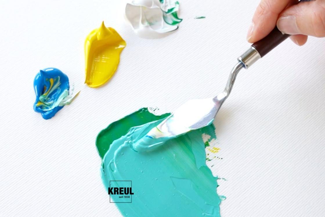
Soft green shade mixed from blue, yellow with lots of white
Like all pastel colours, mint contains lots of white. As a result, it appears light and soft. The refreshing colour is determined by a cool green. It's a secondary colour that can be mixed from a cool blue like, for example, cerulean or cobalt blue and greenish yellow like lemon yellow. In the mixing ratio of mint, white clearly outweighs green.
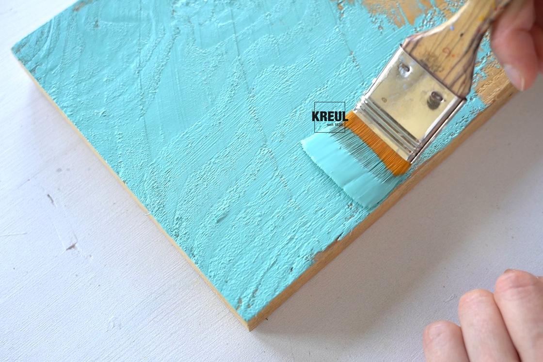
It's not always easy to mix the colour you want. In the KREUL assortment, many colours are available ready-mixed. Mint corresponds, for example, to KREUL Nature Eucalyptus. Other mint variations are available as the KREUL Puffy Paint & Outliner Pen in Mint, KREUL Acrylic Matt Paint in Mint Green, Chalky Paint in Ice Mint and KREUL Glass & Porcelain paint in Chalky Ice Mint.
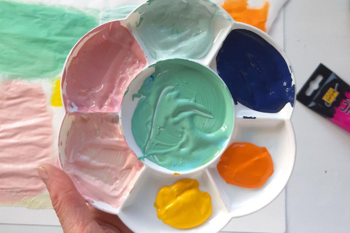
How do you combine the colour mint?
Mint can be combined with other pastel colours. Rose is directly opposite in the colour wheel and makes mint appear sweet and carefree, Neutral colours like white, beige or taupe give mint a fresh touch. Together with a warm yellow, mint looks summery. Strong contrasts are obtained with dark colours like dark blue, violet or anthracite, with Mint adding a light note.
