Colour of the month: Rose pink
03/07/2023 |
Rose pink: first a colour for boys, then the preserve of girls
Rose pink gets its name from the Latin "rose" for the flower. The petals of this flower are resplendent in precisely this soft and charming colour. For a long time, the colour was known as rosy red or just rose. The name pink only became common in the 18th century.
Rose pink appeals to us as a graceful, gentle and romantic hue. No wonder that little girls love to surround themselves with rose pink and feel like fairy-tale princesses. But for a long time, rose pink was absolutely a boys‘ colour! After all, pink was regarded as a diminutive form of red. It was derived from the intense signal colour red. This stands for strength, struggle, blood and was regarded as very masculine. Rose pink was a softer form of red and therefore assigned to boys.
Blue, the colour of the Virgin Mary, was considered the favoured colour for girls. In the middle of the last century, the religious significance of blue paled in the everyday life. At the same time, the influence of the fashion industry grew. In the 1940s, jeans became popular in Europe. They were practical work trousers for tradesmen. These professions were predominantly the domain of men. So blue and pink gradually traded places.
Millennial pink: a delicate hue triggers a trend
At the latest, since Barbie came onto the scene draped in layers of pink in the 1950s, pink has been the favourite colour of little girls. Pink’s magical attraction for girls and women has been commercially exploited by a host of companies. It was soon clear: pink-coloured products were made for girls and women. Since then, pink has been regarded as the most feminine colour there is.
Today, it’s all change again. Pink has become a modern colour, and that for all genders, with the sudden emergence of millennial pink, which swept away any old-fashioned ideas about pink. Worldwide and within a very short time, the colour triggered such a hype that it was mentioned online over 32 000 times in 2017. On social media, photos have been posted at #millennialpink, which show a cheerful and lively shade of pink. This shade somewhere between apricot, salmon pink and grapefruit stands for a carefree attitude to life - for both women and men.
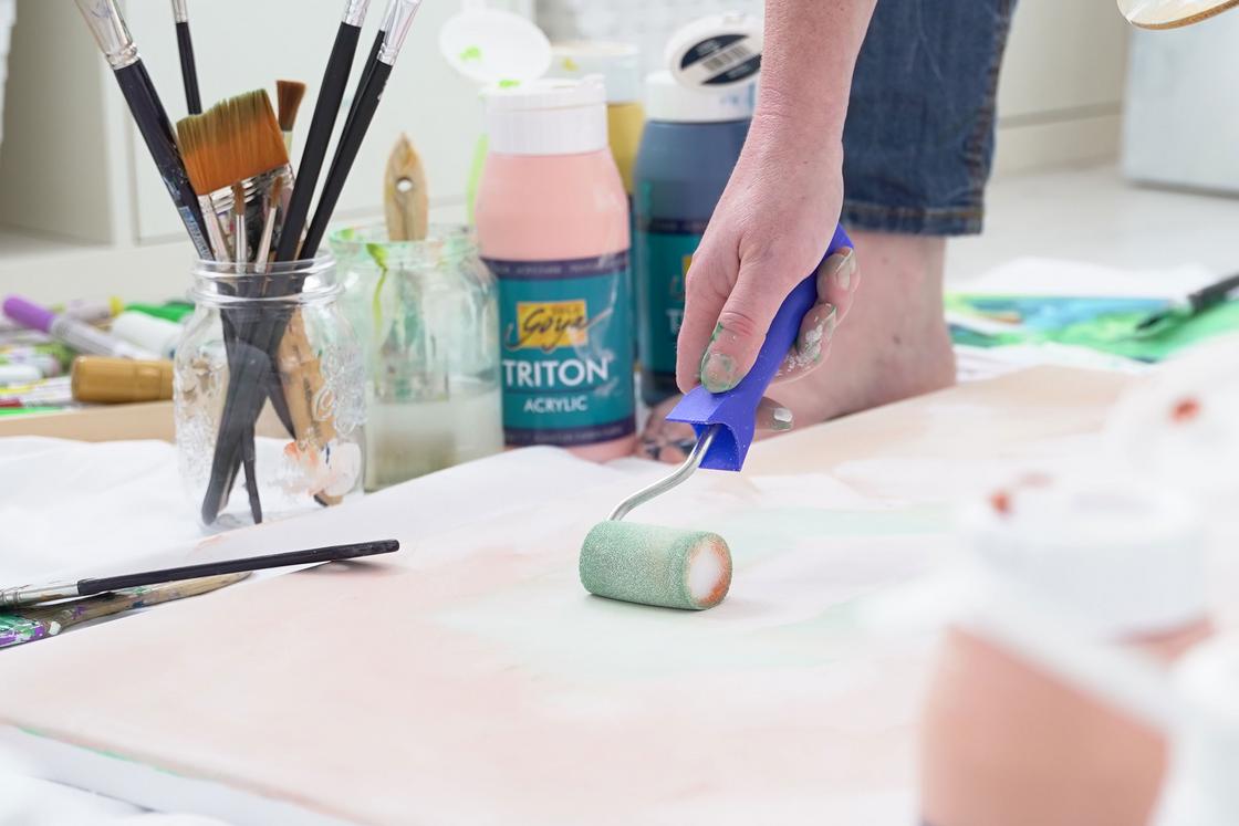
Between lightness and electric energy
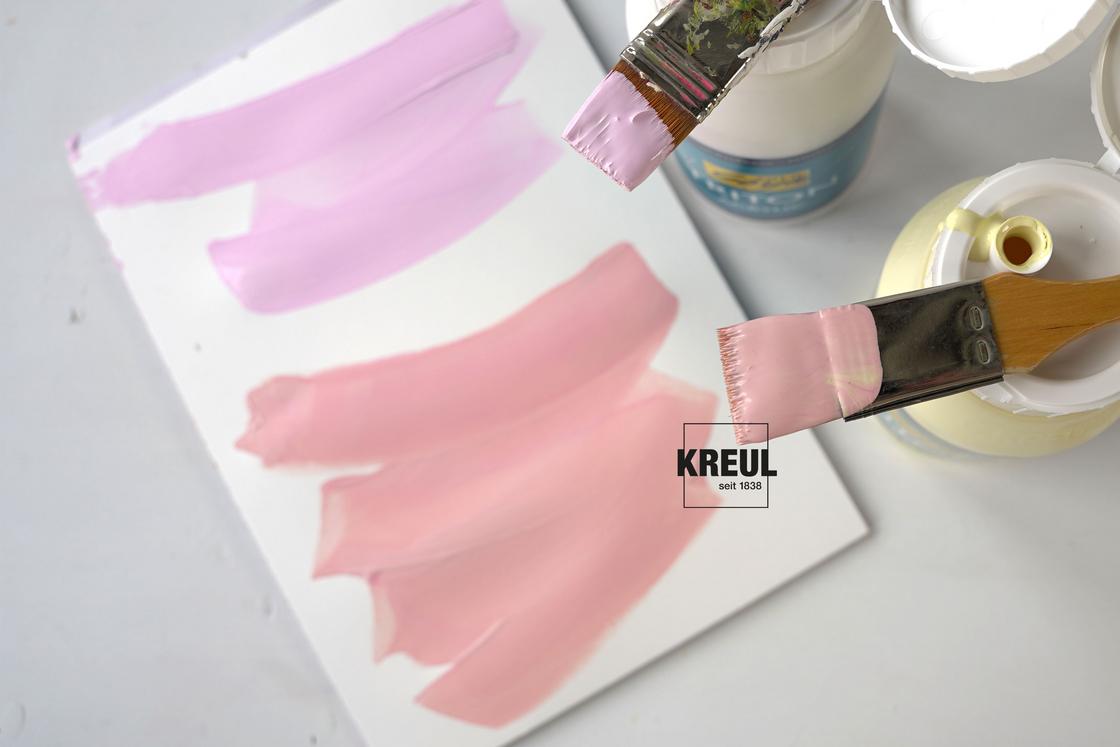
Pink is a colour mixed from red with lots of white. If you mix in a bit of blue, the pink shade becomes cooler. With a little yellow, it turns warmer. Or you can mix the colour from a yellowish white, like ivory, with a splash of magenta.
Light pink shades are usually associated with love and caring. They appear delicate, soft and romantic. Stronger shades remind us of candy colours and stand for playful airiness. If you use less white in the mix, then you get an intense pink bursting with energy.
Every mixture resonates with joy and optimism. Sceptics warn us not to look at life through rose-tinted glasses. But when, at the end of a long winter, the cherry trees blossom in pink, we are delighted to be carried away by nature’s hopeful new beginning.
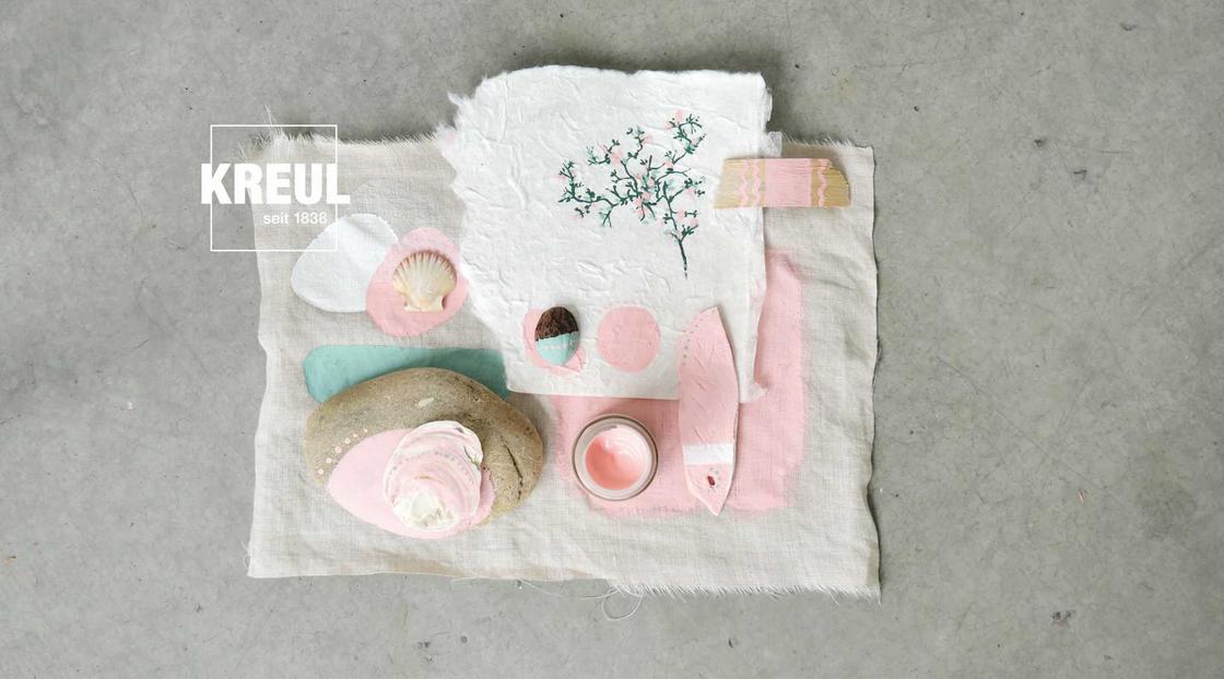
Gentle, glamorous or naturally beautiful: pink at KREUL
This gentle colour stirs in us a yearning for spring. Perfect to get in the mood for Easter and warmer days with some DIY projects. At KREUL, you can find rosy pink shades in almost all of our product colour palettes. Sometimes they have a warm undertone, sometimes they are refreshingly cool and sometimes they shimmer with a thrilling metallic glow. How about these three rose variations:
KREUL Nature Hibiscus
Our most sustainable rose pink is inspired by the beauty of nature. Cheerful and carefree, this shade is a radiant colour. KREUL Nature Hibiscus is full of charm to truly treasure. That’s why we have made this paint as responsible as possible.
KREUL Acrylic Metallic Paint in Rose Gold
Here elegance is married with romance. The soft rose shade appears delicate, but with a touch of glamour thanks to the metallic effect. Perfect for stylish lady chic.
KREUL Chalky Paint Mademoiselle Rosé
This playful rose shade is very close to white, making it appear light, airy, with Nordic subtlety. Ideal for a sweet highlight on jewellery boxes, accessories and furniture.
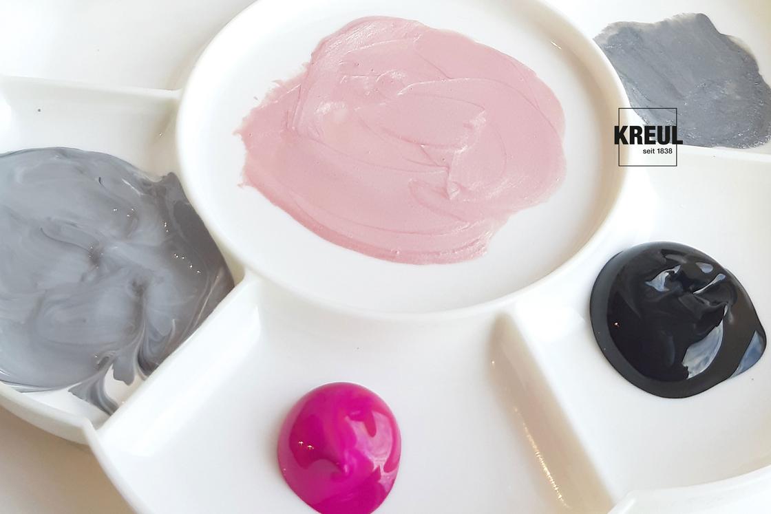
How do you combine rose pink?
The gentle character of the colour is shown off best with an understated combination partner. Neutral colours like white, grey or black provide rose pink with a fitting backdrop, allowing it to really radiate. So rose pink preserves its delicate colour and so doesn’t appear too brash. With lots of white, rose looks summery and airy. If you favour rose pink as a spring colour, then combine it with green hues, for the flair of a blooming flower meadow.
