
Color of the Year 2022: Very Peri
02/08/2022 |
Lilac with a blue undertone
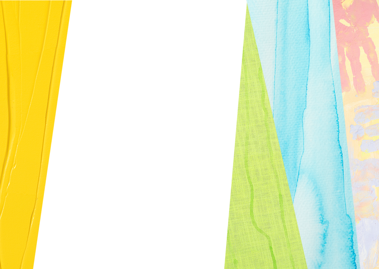
At the first glance, Very Peri looks like a light violet shade. The colour makes us think of the KREUL Chalky paint Pure Purple and SOLO GOYA Triton Acrylic in Lilac. Other KREUL colour shades like Mallow or Violet are also reminiscent of the Color of the Year 2022. If you look more closely at Very Peri, you’ll discover a lot of blue as the basic shade. So it’s very practical that you can easily mix KREUL paints. If you want to make Lilac a little more bluish, just add a little blue to reveal a new facet of this good-mood colour.

Full of creativity and dynamic spirit
Fancy some more colour creations in cool bluish violet? Then we recommend a mix of water, Magenta and Indigo Blue of the SOLO GOYA Aqua Paint Marker. Wonderful how the original colours blur into a feminine purple shade. If you want to use this exciting colour as a highlight on canvas, mix SOLO GOYA Triton Acrylic Ultramarine Blue with White and a little Carmine. The vibrant bluish violet radiates power, but appears mystical at the same time. Spirituality and profundity are also associated with purple colours. Unlike like a light blue shade, Very Peri is therefore shrouded in an aura of extravagance. We see violet shades as a fantastic splash of colour in the grey every day. It appeals to our senses, inspires courage and boosts energy.

Stylish eye-catcher and soft mood-maker
Cool bluish violet shades like Very Peri can be combined to reveal many different effects. Next to neutral colours like black, white or grey, it surges forcefully to the fore. So you can use bluish-violet accessories like vases, plant pots or cushion covers to get instant and stylish highlights in your home. Alongside light green, violet shades bring a burst of spring into your home.

Background: Pantone Color of the Year
Colour is our life and inspires ever new creations. We have let ourselves be carried away by the Pantone-Color of the Year 2022 Very Peri. For 23 years, the Pantone Color Institute has chosen the Pantone Color of the Year. This influences product development in many branches in the design sector. The selection process for the Pantone Color of the Year is based on careful considerations and trend analyses. Every year, colour experts comb the world looking for colour influences from the entertainment and film industries, in art collections and the works of new artists, in fashion, all areas of design and much more.