Colour of the Year: Magenta
01/19/2023 |
Trend colour since Victorian times
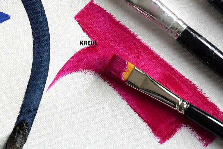
PANTONE 18-1750 Viva Magenta is a dark red with a cool note. The magenta shades at KREUL contain more blue and are jazzier. Perfect for giving DIY projects and artwork an extra kick.
Magenta hasn’t just been an absolutely on-trend colour just since 2023, back 200 years ago, the colour was already fascinating the fashion-conscious. Dresses, petticoats, bonnets, stockings, parisols and fans in the Victorian era dazzled in radiant magenta. In those days, the colour contained traces of arsenic, a deadly poison, which fortunately is no longer used nowadays.

Rebellious colour with a bloody history
Almost at the same time, several chemists discovered the colour magenta. In 1859, the French chemist Francois-Emmanuel Verguin observed how the substances aniline and tin chloride reacted with each other to produce a reddish-purple dye that he called fuchsine – after the flowers of the fuchsia plant. Parallel to that, the British chemists George Maule and Chambers Nicolson came up with an almost identical dye that they named roseine. The paint and dye manufacturers ulitmately renamed fuchsine and roseine to magenta.
The name magenta was taken from the bloody battle of Magenta. During the Second Italian War of Independence, so much blood was shed in this little town near Milan that the earth changed colour. Despite this sad event, the synthetically fabricated colour soon enjoyed immense popularity. Today, magenta is associated with rebellion, self-assurance and extravagance.
Between red and blue – opposite green
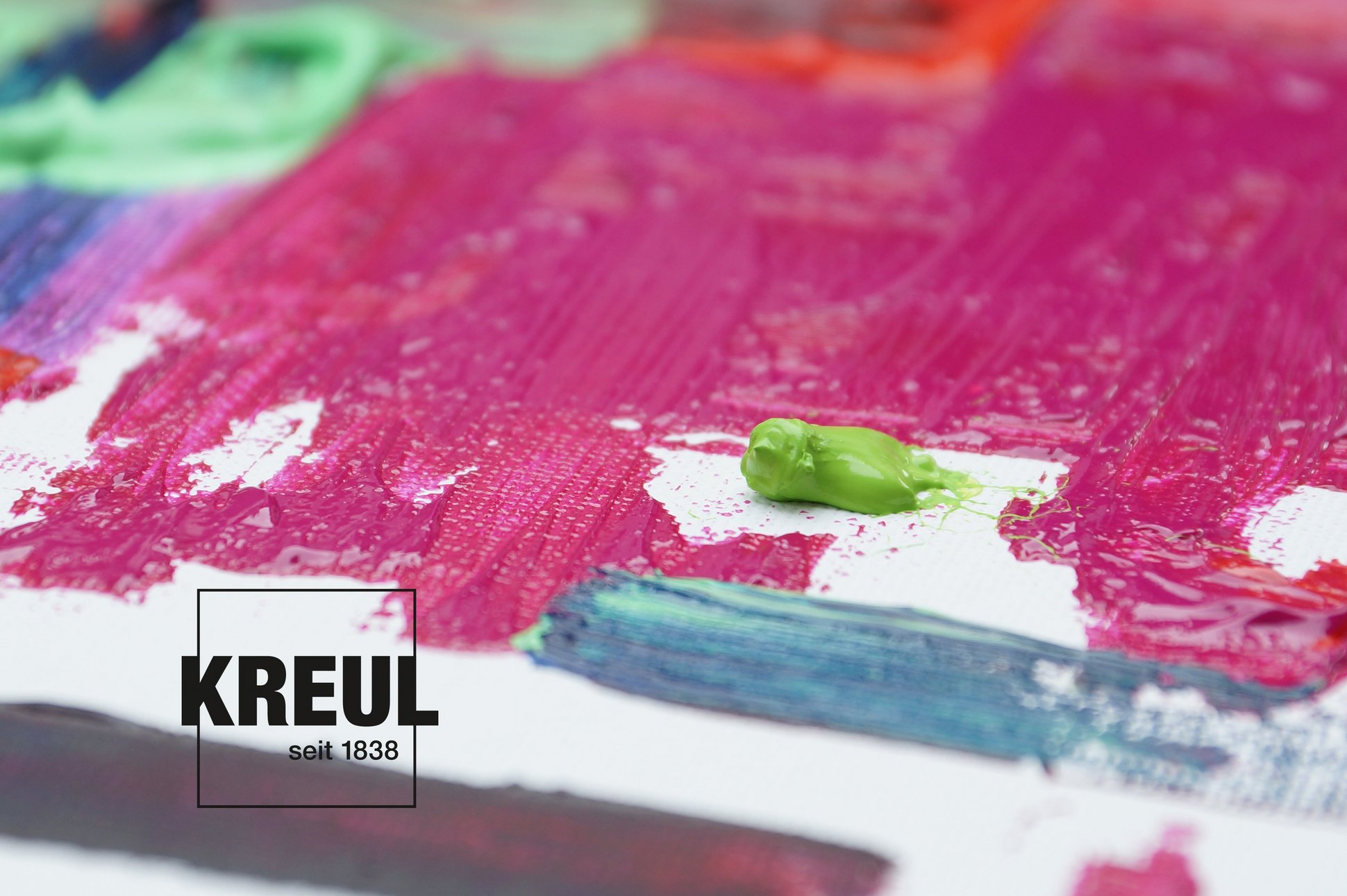
In the colour wheel, magenta nestles between red and blue as it contains both red and blue, although red dominates. Other names in the German-speaking region are reddish purple or pink. Magenta is particularly important for print media like magazines, flyers or catalogues. Along with yellow, cyan and black, it is one of the base colours in the CYMK printing process. These four colours can be used to reproduce all other colours on paper.
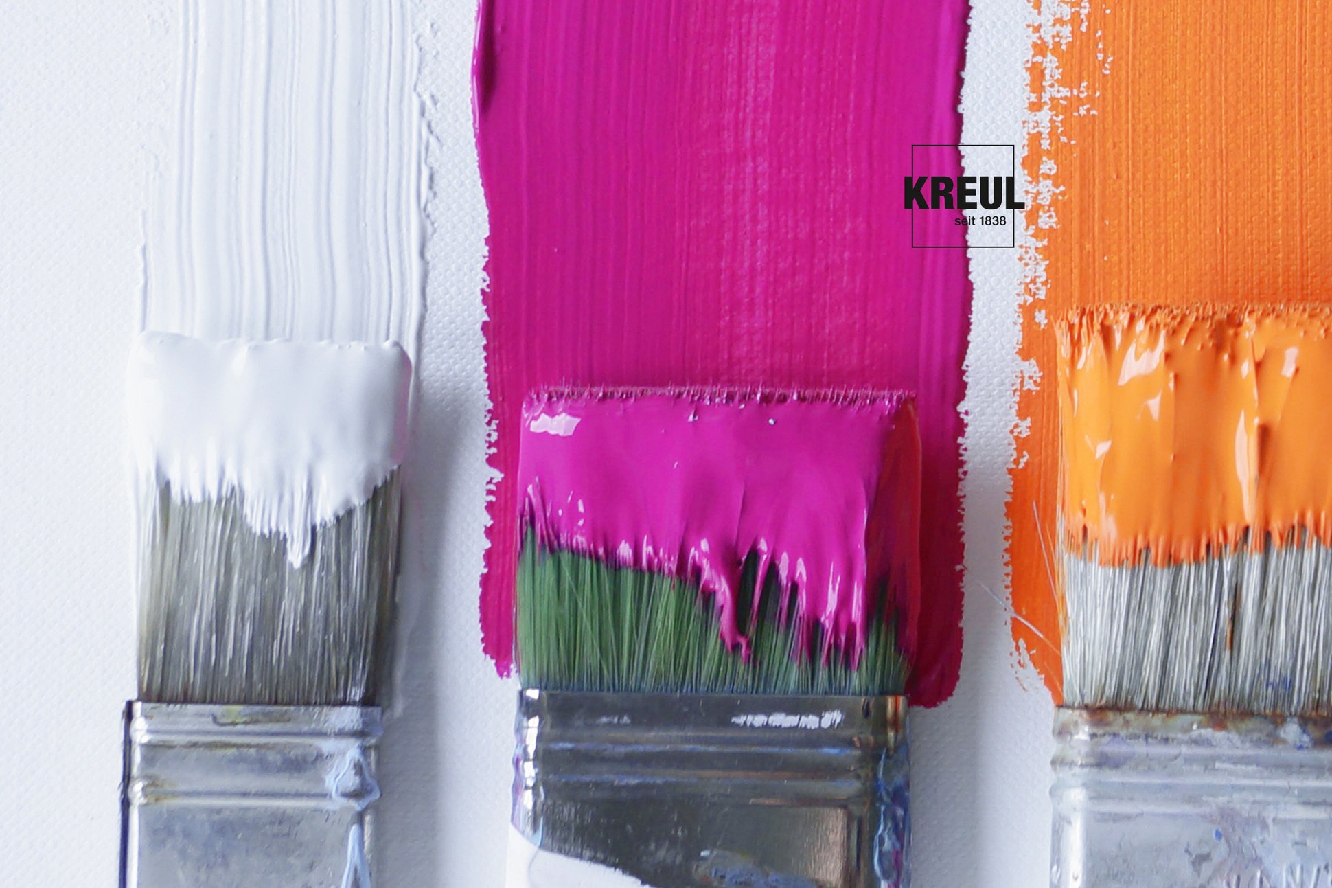
Magenta’s complementary colour is light green. It makes the intense red shade really pop more than any other colour. Other intense combinations are obtained with orange or yellow. Neutral colours like white, black or beige vitalizes magenta. A fantastic way to add a burst of freshness to plain furnishings with magenta-coloured deco objects or art. What are the possibilities? For instance, SOLO GOYA Acrylic Magenta, KREUL el Greco Acrylic Magenta, KREUL Acrylic Gloss Paint in Magenta, KREUL Javana Silk Paint in Magenta, KREUL Magic Marble Marbling Paint in Magenta and many more.
Background: Pantone Colour of the Year
The Pantone Color Institutehas been choosing its Colour of the Year for over 20 years. Many branches take their lead from this colour. The selection process for the Pantone Colour of the Year is based on trend analyses. Colour experts keep a look-out worldwide to see which colour is currently influencing the entertainment and film industry, art collections and the work of new artists, fashion and design.
Material
SOLO GOYA Acrylic
KREUL el Greco Acrylic
KREUL Acrylic Gloss Paint
KREUL Javana Silk Paint
KREUL Magic Marble Marbling Paint
