
Which colours go together?
08/23/2023 |
Colour harmony 1: one cool highlight alongside warm colours
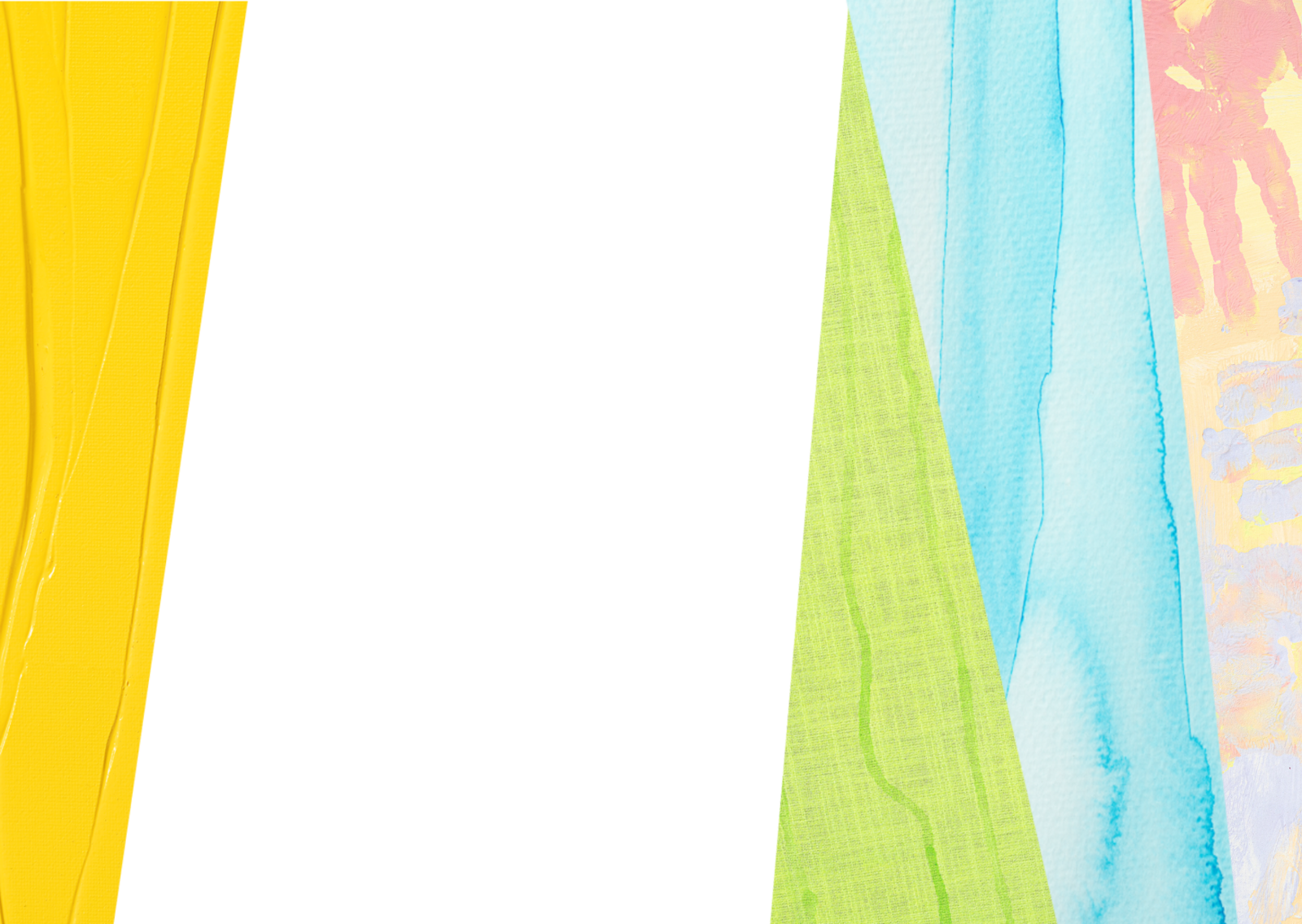
In the colour wheel, yellow, orange and red lie next to each other – these are warm colours that exude energy and passion. A picture in which mainly warm colours are used generates an intense feeling of heat and fire.
Violet, blue and green are classed with the cool colours in the colour wheel. They are perfect for depicting water and cold, but also convey distance and clarity. Exclusively warm colours or exclusively cold colours go well with each other and appear harmonious. Heat and coolness can also be achieved with other colour nuances. So green shades like turquoise appear cool, green shades like olive green, on the other hand, seem warm.
A special effect is obtained with a warm-cold contrast, like a little blue in combination with lots of sunny yellow and red. It is fun to experiment with these colours and discover other warm-cold combinations!

Colour harmony 2: complementary contrast
Colours lying opposite to each other in the colour wheel get each other to really pop. These are the combinations of violet – yellow, blue – orange and red – green. These colour pairs are intensive and create strong eyecatching effects. But complementary colours can quickly look “too much", which is why many creatives don’t dare use these combinations.
But without good reason: the bright colour effect can be balanced out by using the colour wheel neighbour as a colour partner, that is instead of yellow – violet, preferably orange – violet. Lighter variants of the colours, e.g. apricot or lilac also look harmonious together.

Colour harmony 3: bright contrast
Okay – white, grey and beige are timeless classics. But bright colour combinations simply look more cheerful. So grab some vibrant colours like sky blue, pink and lemon yellow. Together, these colours can look powerful and harmonious.
Saturated, intense colours sometimes tend to outdo each other. Colour partners should be selected carefully. Harmonious combinations with “bright” colours can be created if one warm, one cold and one dark colour are included in it. Like in the KREUL Color Living Set of matt acrylics. Dark Blue, Golden Yellow, Pink, Turquoise, Lemon and Carmine go wonderfully with each other and lift the mood.

Colour harmony 4: pastel colours
It doesn’t always have to be bright. Especially for the design of décor items, more subtle colour combinations look wonderful and create a feel-good atmosphere. Perfect partners here are pastel colours as they convey a gentle and graceful impression. So with colours like rose, mint green, beige and lilac, you can create calming and relaxing colour combinations.
Pastel combinations can appear very pale when used together with lots of white. They become more vibrant with splashes of a strong colour like yellow, orange or pink. This way, artwork and DIY projects gain a freshness. If a dark colour like, for example, dark blue is added, an interesting contrast is created that gives a frame to the pastel colours. Have fun trying out different combinations!