


Colour of the month: Orange
08/23/2023 |
First nameless – then many variants
Orange comes in many guises: brownish amber, intense tangerine, delicate peach, fresh apricot, reddish-brown terracotta, fiery coral and many more. It is striking that the name of the colour takes its lead from objects with a surface that shows the colour – often the names are those of fruits.
It is interesting that, for a long time, the colour orange did not have its own name, So into the 16th century, it was described as “yellow-red”. The name orange became established in Europe when the first oranges arrived on merchant ships and the fruit became better known.
Over many centuries, making the colour orange was difficult and it was rarely used as a result. With the production of synthetic orange pigments like cadmium orange and chrome orange, the colour became more popular.
Colour mixed from warm basic shades or cool pink
In the colour wheel, you'll find orange between red and yellow. It is a secondary colour, mixed from yellow and red. With lots of red, you get a dark reddish yellow, if yellow is dominant, then you get a bright yellowish orange.
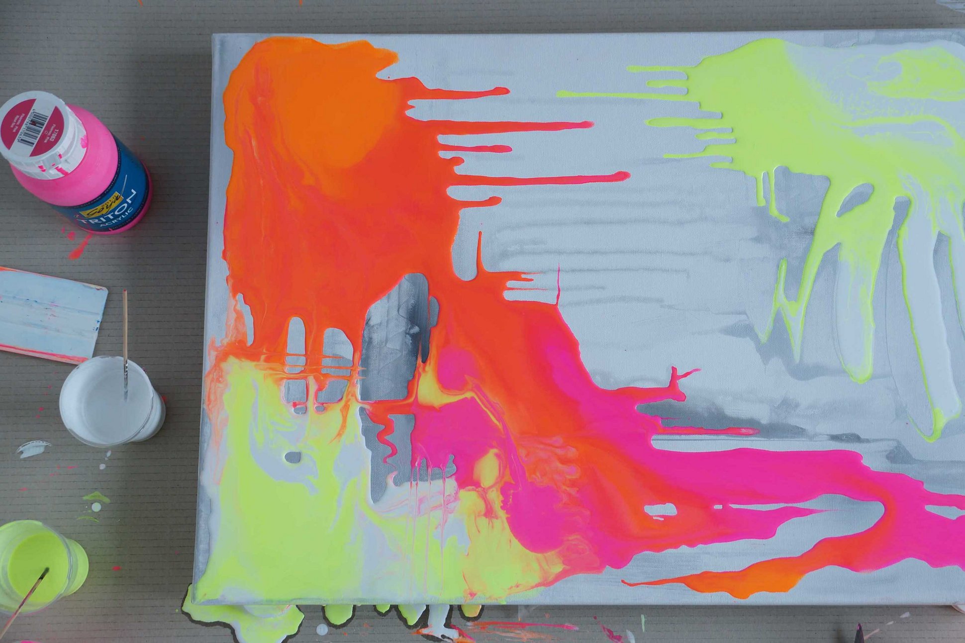
Orange is a warm colour without any cool undertones. These would make orange look dirty. Nevertheless, a special tip is to mix orange from cool neon colours. By mixing fluorescent pink and fluorescent yellow from the SOLO GOYA Triton Acrylic series, you get an orange shade with intense character. And the mixed shade even glows under black light.
Orange is well suited as a basis for mixing light skin tones. For this, mix a lot of white into some orange. In the colour wheel, orange lies opposite strong blue. If you mix these two colours, you get a neutral anthracite shade. The strong contrast of blue and orange is often used by artists. So even works by the impressionists feature this colour combination.

Impressions of orange: summery and cheerful
Orange shows that the combination of warm and cold colours can have great impact. Orange instantly catches the eye. If you add some orange against a blue background, the eye of the beholder is instantly drawn to the orange. The colour is therefore used as a signal colour, e.g. on lifeboats or in road traffic.
Orange reminds us of warm southern climes and has a positive influence on our mood. In orange-painted rooms, we are more attentive and relaxed. And if you find orange too bright, you can go for the pastel shade of apricot or place orange next to soft pink, to get a cheerful composition for summery decorations.
