Colour of the month: Red
05/22/2023 |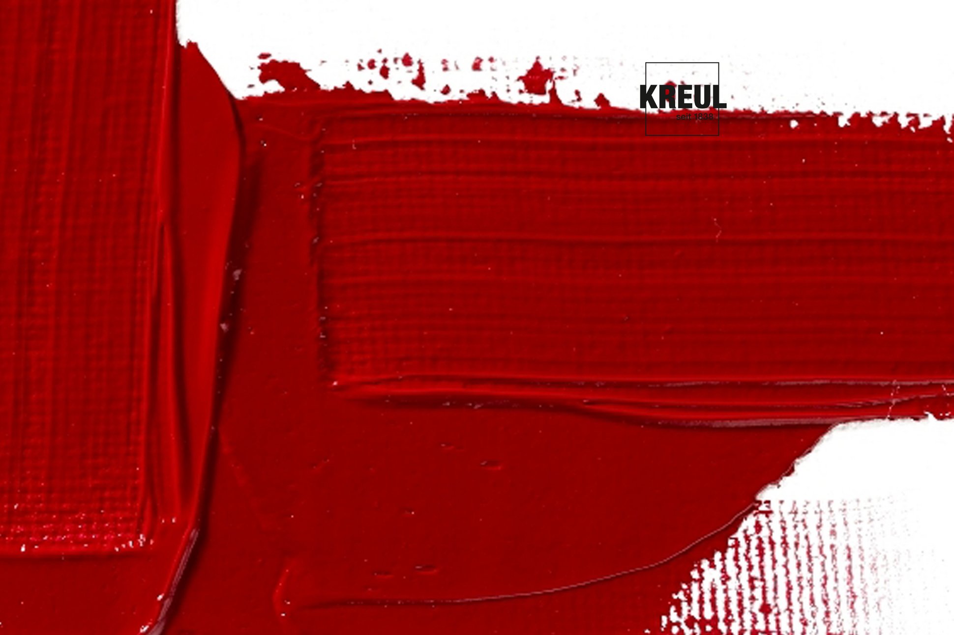
Signal colour with prehistoric roots
Love, passion, blood, rage and sacredness – all that is associated with red, No wonder that the colour stirs up strong emotions. A room painted in red can even quicken heart rates. In nature, red is used to scare predators away from an apparently poisonous prey or to attract attention for mating.
But besides bright red ladybirds or red berries, red is also found in nature as an earthy colour. And so it was the first paint to be used by humans. Back in prehistoric times, early humans painted cave walls with earth containing iron oxide. Since then, we can no longer imagine art without red ochre, also known as red chalk. In the Renaissance, red chalk was used for sketching. Artists like Michelangelo or Rembrandt liked using ochre chalk, leaving us with numerous studies in this reddish brown shade.
Less is more: Red as an intensely colouring primary colour
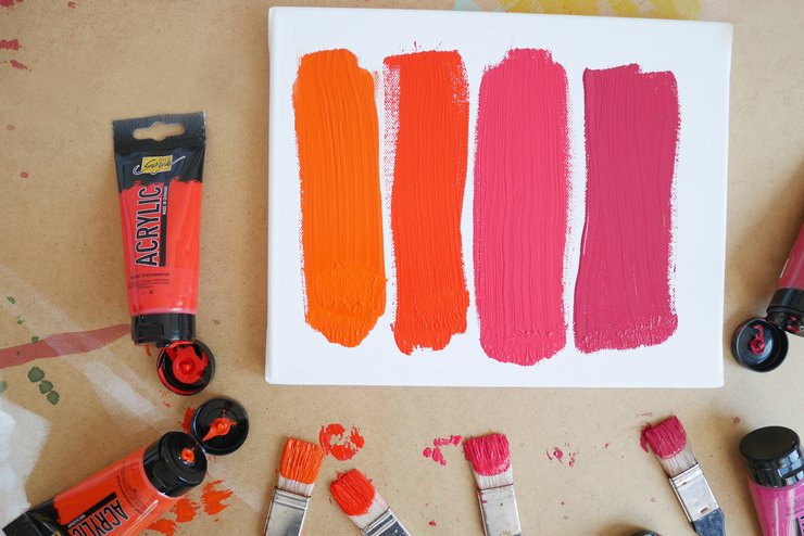
In the colour circle, red is a primary colour. That means that it is a key component in mixed colours like orange or violet. Even colours like brown have a bit of red in them. For lots of colours, reds adds a warm undertone. But if you are mixing colours with red, you should start off by adding just tiny amounts. For example, SOLO GOYA Triton Acrylic Genuine Red is a strong colourant. Just a drop of this colour makes the mixed colour much redder.
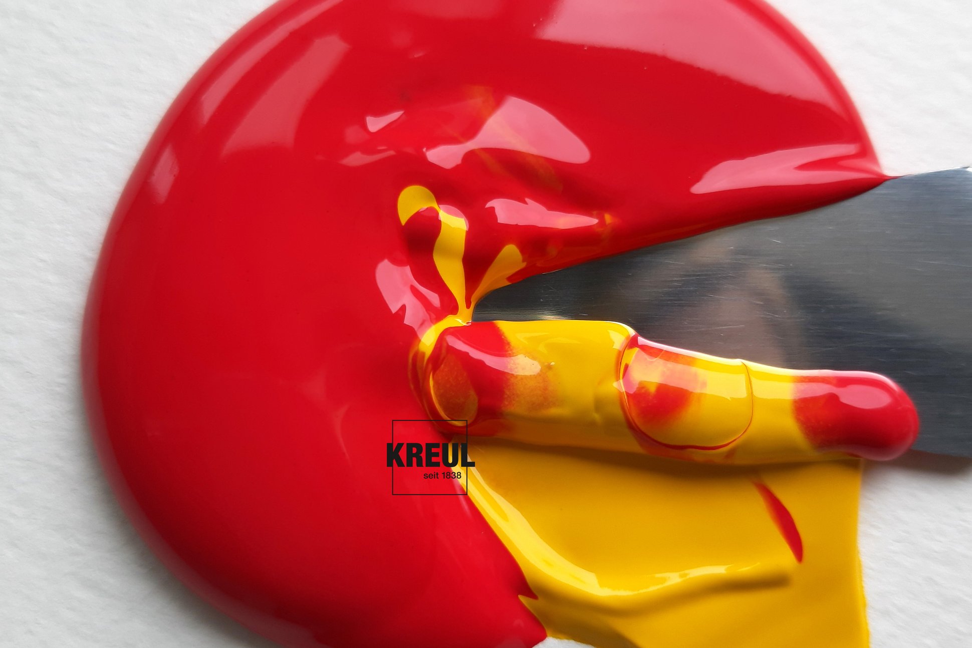
How can you mix red to make it lighter? Normally, you would use white to lighten colours. But if you add white to red, you don’t get light red but pink. The solution here is yellow. If you mix a little yellow into red, you get a light red. But the more yellow you add, the more mixed colour tends towards orange.
You can darken red with a small amount of black. But a drop of the complementary colour green makes red darker, too. But this can weaken the colour saturation, making the darker mixed red look greyer. If you want rich, radiant reds, you should reach for a dark red shade like SOLO GOYA Acrylic Wine Red.
Red pushes its way to the front
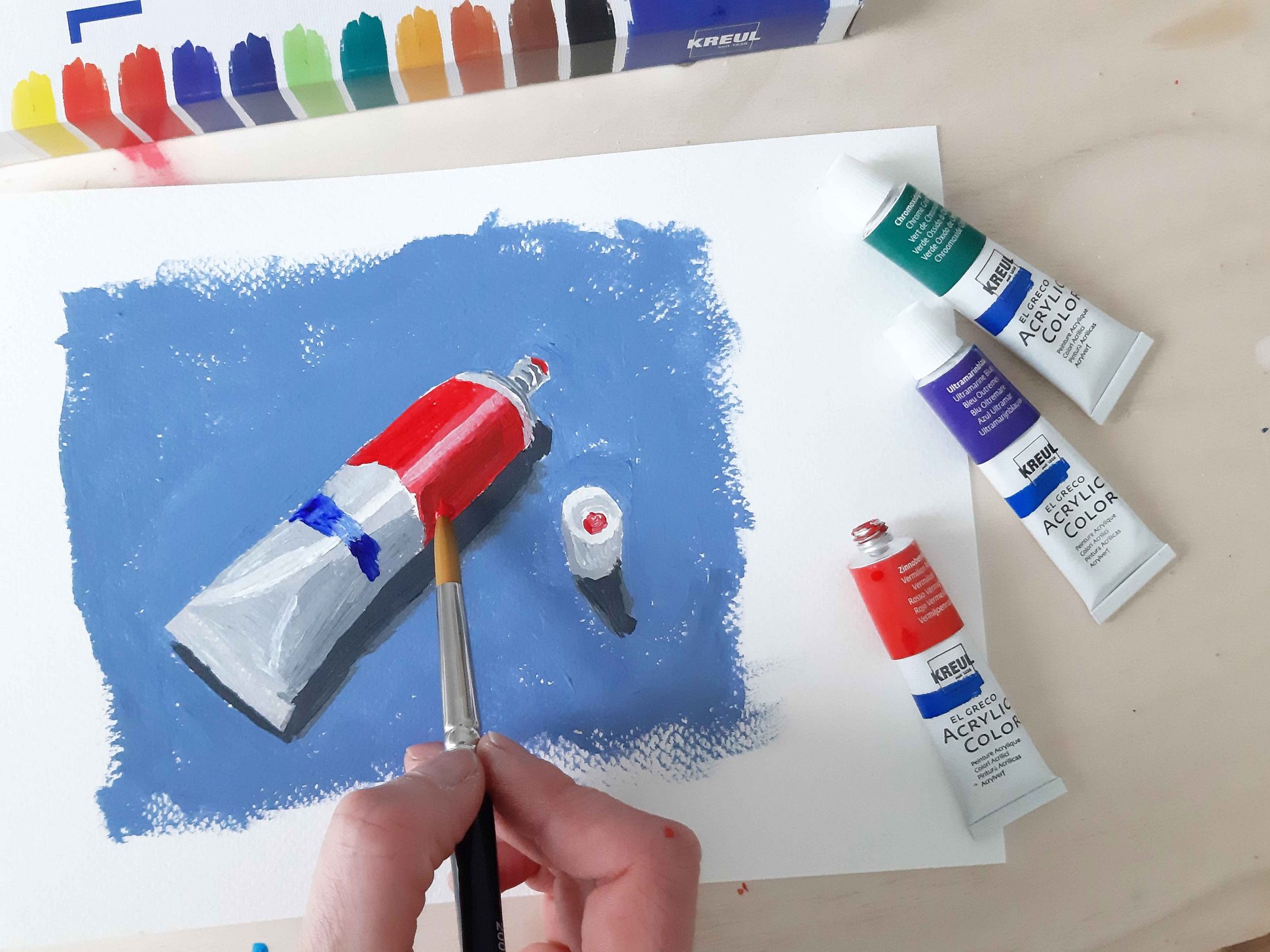
Red will draw everyone’s gaze: whether its red stilettos, celebrities parading up a red carpet or red lips. A phenomenon that is also popular in the art world. Artists like to add a final flourish in red. Red is one of the warm colours and is therefore often used to create the impression of spatial depth in a picture. If you put red in the foreground while choosing cool, low-contrast blue shades for the background, your motif will appear almost three-dimensional, like here in our painting with KREUL el Greco Acrylic paints.
This contrast between warm and cold always arouses interest – in the home, too. A few red highlights on tableware, cushion covers or flower vases immediately creates an invigorating, but warmer atmosphere. So it’s useful that we have included several red shades in the most of our paint lines.
