
Neutral grey to bring balance into bold-colour artwork
04/25/2022 |- SOLO GOYA Triton Acrylic
- KREUL Triton Acrylic Marker
- Ideen für Künstler

A sound foundation in neutral grey
We start off by painting SOLO GOYA Triton Acrylic in Neutral Grey onto the canvas. The paint has a liquid consistency and is easy to apply with a wide paintbrush, We cover the entire canvas with the artists‘ acrylic paint in studio quality. This gives us a sound foundation for the next layers of paint. Many artists choose SOLO GOYA Triton Acrylic for this as the paint goes a long way. Grey is mix of black with lots of white and, of course, you can mix it yourself. But what we like about SOLO GOYA Triton Acrylic Neutral Grey is the mellow undertone reminiscent of dried concrete. A super trait for modern, abstract art!

Neutral Grey and Fluorescent Pink: For bold colour expression
We use a pipette to splatter KREUL Triton Acrylic Ink in Fluorescent Pink to the grey-primed canvas surface. Wow, how the pink really pops! Against the neutral background, the colour really grabs your attention. Fluorescent Pink is applied as a colour wash, so the surface underneath shines through, The neutral grey moderates the bold pink, toning it down to a darker, less in-your-face shade as it is painted. A harmonious counterpole offsetting the flashes of fluorescent pink. And if you want to tone down the colour even more, simply work the Fluorescent Pink into the still wet, neutral grey areas. After all, you can mix colours on the canvas as well as on your painting palette.

Accents in Neutral Grey and White for balance
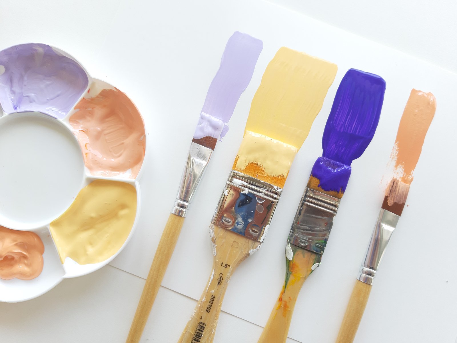
For another highlight, we add flourishes of KREUL Triton Acrylic Ink in Fluorescent Yellow to the canvas. It magically draws your gaze into the painting. We paint a violet colour mix to the outer fringe of the artwork, to introduce a complementary contrast. Too many intense colour shades? Then it’s time for some accents with the KREUL Triton Acrylic Marker in Neutral Grey. Here, a few grey lines, there a grey leaf ornament – the composition of the picture is already much calmer. Thanks to the neutral grey background, the white really stands out and can also be added as an oasis of calm. We draw bold strokes with the KREUL Triton Acrylic Marker XXL in white and take a step back. What a colour-intense artwork – but certainly not too brash, thanks to neutral grey!

Material
SOLO GOYA Triton Acrylic
KREUL Triton Acrylic Marker edge
KREUL Triton Acrylic Marker XXL
KREUL Triton Acrylic Ink