Freshness. Boldness. And a pinch of glamour.
02/19/2019 |
- Pink stands for boldness, smart ideas and feminine power.
- Golden gives that special something that is sometimes simply necessary in life.
- Green stands for sustainability, freshness and growth, for life energy and creative power.
- White neutralises, soothes and comforts.

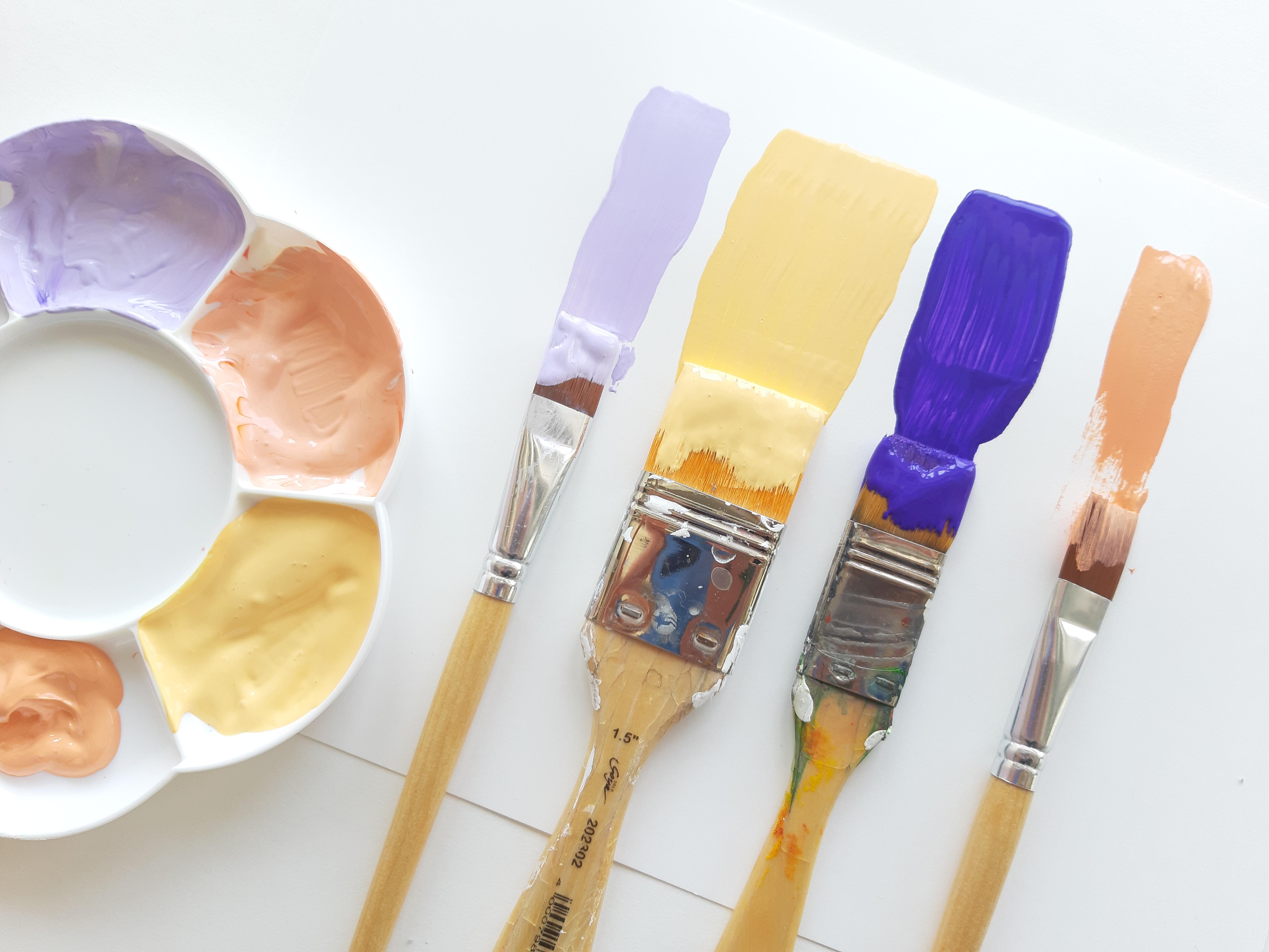
Various different consistencies come upon each other - and they show how diverse the KREUL paints can be: pastose golden and sparkling pink, creamy white and fluid green. Like our environment and also the surroundings, the colour composition consists of different colour characters that lead to a strong presentation.
Our message: Be bold and design the world with freshness. By doing that, don't forget to leave the usual paths. Because that's what constitutes creative design with the KREUL paints. Freedom for art!


